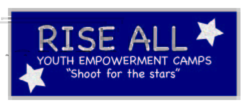
This is my draft for the logo project this week, I actually had a lot of fun working on this logo and I am also very proud of it. I started off during the logo sketch with many different ways that I thought of incorporating nature such as a mountain background or as you can see having stars. A big part of the company and camps that I want to create one day, is having them based in nature so having the logo represent that was important to me. The process of creating this exact logo actually came relatively easy, I took a bunch of the suggestions I got in the graphic design project and tried to implement them in my work here. I got suggestion that in the last bit of work that it was hard to understand what Rise All exactly was, so here I added that they were “Youth Empowerment Camps” right underneath the title. I then decide to add a motto underneath the description, this however took a little bit of time to finalize on. I thought of “Shoot for the Stars” as it was a way to incorporate both the empowerment of these camps and for kids to have big dreams, as well as again tie it back to the nature importance. For this logo I chose dark blues as the backing color and greys to use as the text color to create a night feel to relate back with astronomy idea. Using pixelates stars was an idea I was very excited to use, I see this feature a lot in social media and have noticed it becoming a fad within the past months. I didn’t have one issue towards the end of this assignment as when transferring this assignment to WordPress from Adobe illustrator. You may be able to notice a red hue in the wording that is in a lighter grey, I am open to suggestions on how to combat that issue for my final logo illustration.

Hi again Jenna! I’m so excited to see what you have done for the logo project. I think the phrase you have chosen to represent your nonprofit is beautiful. I really like the idea of focusing on stars to represent your organization; maybe you can create a vector of a shooting star (or stars) and have the name of your organization along with the motto on the bottom of the logo to effectively use your space and achieve more of a unified image for your logo. For the red hue showing up in the lighter grey text I suggest you selecting transparent for the outline, it’s the box with a red line across it. I hope that helps! To easily create vectors I suggest you follow instructions on the tracing logo tutorial. You can trace vectors from any picture you want—even your own sketches! I’m really looking forward to your final product and hope everything is smooth-sailing!
LikeLiked by 1 person
Hey Jenna! I love the colors you chose for this logo! The lovely royal purples and the beautiful silver greys really bring out the feeling of your overall company/project. I can totally see this logo on the back of a camp sweatshirt or as a water bottle sticker. It has an overall welcoming and wholesome quality to it. My first suggestion would be to try putting a grey boarder around the stars to make them more cohesive with the other parts of the logo. I think it would also be cool to try adding a simplified mountain range made of triangles with a pretty gradient to the background like you originally brainstormed. I really liked how you added the moto for your camps to the logo design as well…only thing I could think of is to add a period! Overall this logo gives me camp vibes from way back when I myself attend summer camp every year and I would say that’s a good thing! It’s a mixture of fun, inspiration, and encouragement. Well done!
LikeLike
Hello Jenna,
I really liked your design! I thought it was very cool and unique! I really liked what you have done with the colors and the wording of your design, I thought it was cool how you used, empowering words into your design to make it clear for everyone, especially for the readers! I also liked the colors that you used as well as the stars and adding small details into your design to make it pop, and I also thought “shoot for the stars” is perfect, for getting the message out there. One suggestion that I have is maybe, the text or font size of your design maybe playing around with the different font sizes. Another thing is adding another color that could contrast with the blue. Overall, I really liked your design and thought you did a really great job with the design!
LikeLike
Hi I’m happy you chose this. We need more youth camp in the world especially in a diverse community for kids to get out of trouble.Try to use more creative for the text.play with the gradient tool.Make the colors less brighter.try to also use more vector to making it more creative.Other than that I like your entire logo and project.
LikeLike