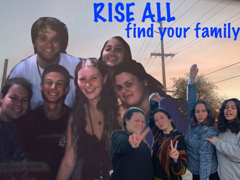
For this project I decided to make an advertisement poster for my “company” RISE ALL. The background picture is of the sunset in my home town that I thought was beautiful, then the two pictures that are on top of that are pictures of my friends and I. The one on the left side was taken during Insight Seminar’s teen program this past summer in July of 2019. Insight has been my inspiration for my own company, so I thought it was fitting that I added a picture of my amazing friends that have come from attending the program. The photo on the right is from my Senior Retreat for my high school class this past spring, these girls have also been a huge part of my life and I believe fit the energy I wanted to build for this project. Next I worked toward the text portion of this design by putting the company title at the top as well as a short excerpt that I wrote saying “Find your family”. I chose this excerpt as my mission for this organization is to host camps and seminars so that kids will have the opportunity to find their life long friends and create memories that will last a lifetime. To construct this piece I used the lasso tool within photoshop to clip the two pictures in order to the place them towards the front and then used the sunset picture as my background. I did have struggles at times to remember exactly how to layer each set and get my final vision across however I referred back to the photoshop tutorial labeled “Cutouts and Blending Modes” for assistance on how to use each tool and I believe I was able to portray what I wanted to convey to my audience.

Hi Jenna! I really like the story and message behind the poster. The passion you have for the cause you believe in is inspiring. I know it’s only a mock non-profit, but I’m excited to see other future projects in relation to this topic! I also really like how you layered your pictures—it gives a nostalgic feeling. I think one thing you can improve is cutting out your pictures. I find the pen tool easier and more effective than the lasso tool. The magic wand is great to get rid off bigger chunks and the eraser tool works wonders for smaller areas that need more precision as you can manipulate the size of the eraser. I think the picture on the left needs a little adjusting because it’s a little dark. You can experiment with the fill/adjustment layer (it’s the half-black-half-white circle icon at the bottom of the layers panel) to manipulate exposure, brightness/contrast, color balance and more. I hope this feedback helps. Can’t wait to see your final draft!
LikeLike
Jenna,
I think your design for your project is really cool. I like the back story with your company, it seems like you’ve made some great friends in life. I also thought it was cool you put a picture of a sunset from your home town, that makes it even more special to you. One thing I would improve is the edit lines around you and your friends. You can see a lot of sky and background around your friends hands and the top of your head in the middle picture. I understand the lasso tool can be kind of difficult to use in certain areas. I would also try to brighten up some of the pictures of you and your friends as well. The ones on the left are pretty dark. The only other thing I could recommend for improvement would be the text. You might want to change the color and placement because it feels a little off. I still think you did a great job and look forward to seeing the final outcome!
LikeLike
Self Reflection-
I have learned a lot from the very helpful suggestions as to what I should do or add to my projects and believe that I have learned a lot of good techniques not only from the suggestions everyone has been so kind in leaving for me, but also just looking at my fellow classmates work and gaining knowledge of what may help my work. I have struggled in the beginning in this class just learning how to use the different programs which has left me a little bit defeated as I really want to advance in this course. I am excited to work on blending all of my pictures together more as well as working on blending each picture together for a more clean advertisement that flows together seamlessly. I am also grateful for the comments that were specific that told me different tools within Photoshop that may work better than the ones I have been using.
LikeLike