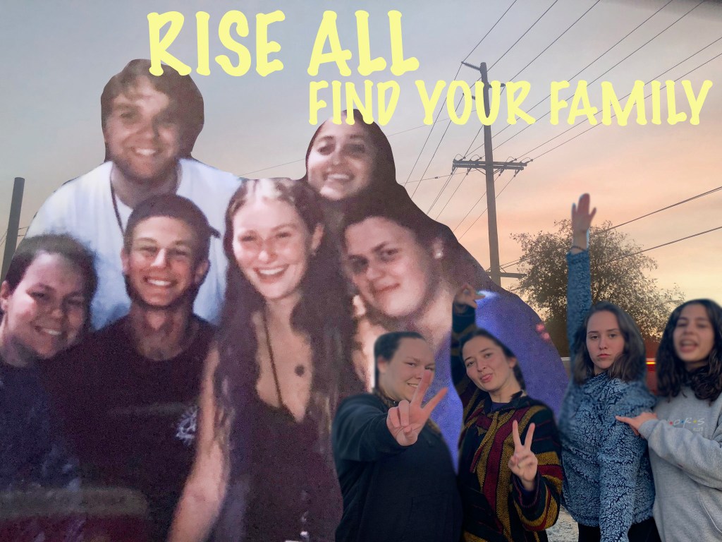
This is my final draft for the Graphic Design portion of the class. From my first draft of not messing with the settings of each picture such as the lighting and hue I could understand every comment and critique that I had received and I was very grateful for. To improve I started by zooming into the first picture that is placed on the right side and using that magic wand tool to cut out the picture to the exact line, whereas before I had been using the lasso tool. Then I took just the picture to the right and used the sponge tool to brighten up that picture specifically as it was a lot darker than the rest. I then when selecting the entire design I brightened that as well. I also got a suggestion regarding the text at the top of the picture so I changed the color of it to a lighter yellow to add a softer feel instead of the bolder blue I had before. Using word press and this graphic design project has taken me back in terms of confidence as I was comfortable with the programming that I had used in high school and I have struggled getting to know how to work and submit the different assignments however I think from the introduction assignments to now I have grown a lot and that is something I am proud of.
